
I’ll start by saying that I know nothing about the grocery store industry. But what I do know is technology and UI/UX. I’ve seen improvements in Kroger’s apps and its website over the past few years but it continues to lag behind its competitors. Not its fellow grocers, of which there seem to be few, but of delivery services like Instacart and Shipt. What makes this so galling is that Kroger is squandering the opportunity in front of them and losing at their own game.
Kroger has the type of data that would make Instacart/Shipt drool. They have a workforce that puts the gig economy to shame. They could and should be leading the pack when it comes to delivery services but instead, their offerings range from barely adequate to infuriating. I’ve been meaning to write about this for some time, partly to just get all my thoughts in one place and partly so that I can move on instead of continuing to rant about it to my friends. I want better for Kroger, I want them to improve, and I want my shopping experience to be better.
Before I start I want to add a small note to the developers behind the Kroger app and website: I know you are not solely to blame for anything I’m about to complain about. I know you probably don’t set the priority list, I know you might not get time to work on things you think should be improved, and I know that you’re probably understaffed and unable to effect real change. My annoyance is directed at your managers and the people above them who do have the power to improve things and either don’t care or can’t see the UI/UX mess they have created by proxy.
Infinite Scrolling
Every long list of data for over a decade has implemented some kind of “automatic pagination” that triggers when you get close or to the end of the current page of data. For some inexplicable reason, Kroger does not auto-load more data. They don’t do it on the web:

And they don’t do it on mobile:
It’s worse on the web, they load 30 results per page and, while I’m glad they reflow the content based on the screen size, it makes it seem like you’ve reached the end of the results when you get to the end of a page.

More times than I can count I’ve thought I had seen all there was to see, “That’s so weird, I just bought the thing I’m looking for last week”, before realizing I’m not at the end.
Suggestion
Ideally, Kroger would just implement infinite scrolling so that when you reached the end they would load the next page but if that’s somehow impossible then they should either only ask for enough results to fill out the row length or any row that wouldn’t be filled out should be hidden until you click “Load More Results”. Of course, infinite scrolling is the clear best answer but with a little development time on the client side only (on the web) you could hide this issue.
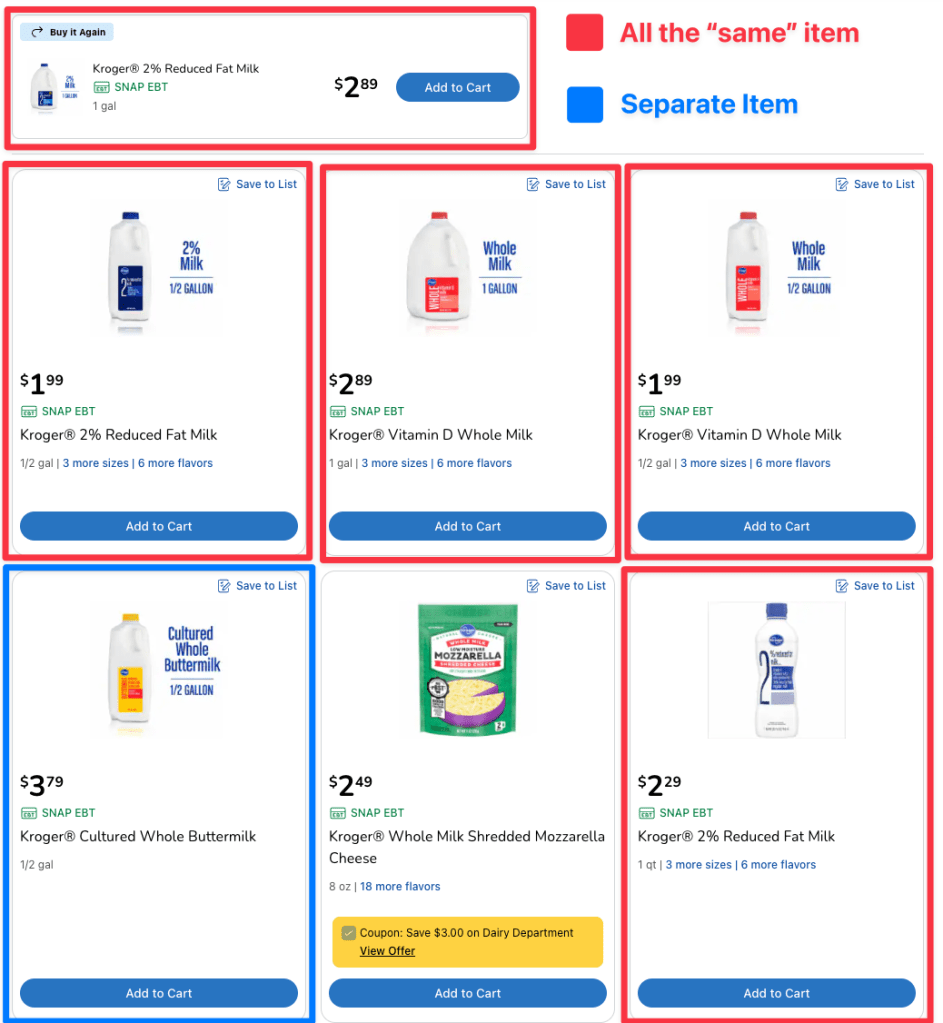
Buy it Again
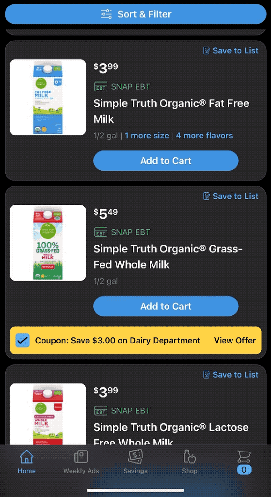
In search results, Kroger will promote something you’ve bought in the past (but only one item) to the top of the search results. On mobile this is fine:
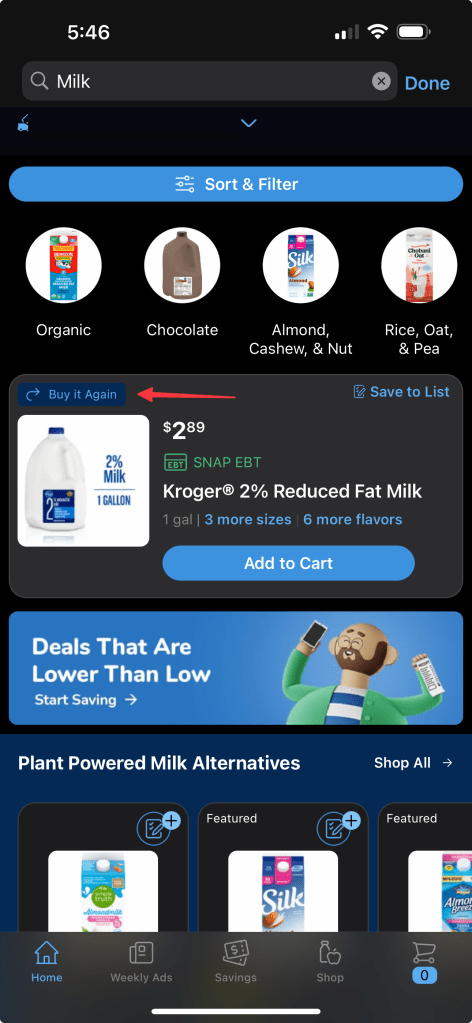
But on the web, they put it above the search results. Maybe I’m the outlier, maybe decades of training myself to ignore ads and focus on the content are biting me in the posterior, but my eyes skip over the “Buy it Again” block every single time on the web. What’s worse is that the “Buy it Again” item will not also show up in the search results. So if you miss it, you’ll never find it, even after you manually paginate through all the results like a caveman.
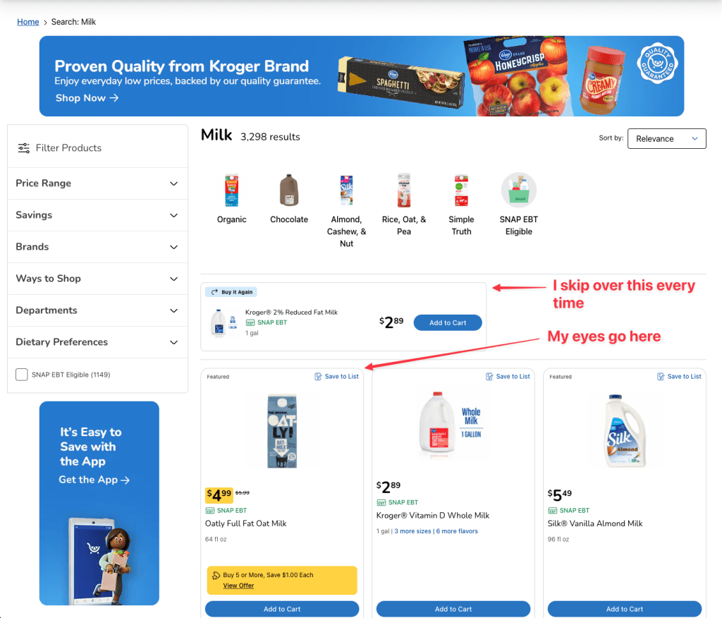
Let’s not even touch on the UI of this page where the results themselves only get ~30% of the page.
Suggestion
Don’t pull out a single item, Kroger also is really bad at guessing what I might want to buy again, just add a banner/ribbon on each item I’ve bought recently. I like that they promote recent items, but put more than just one item up there and make it look like a normal search result.
More Sizes
After complaining about the lack of this feature for at least a few years I opened the Kroger app one day and saw the most glorious thing “X more sizes” showing in blue text on a search result. Finally, I wouldn’t have to remember “Ok near the top was a small size, I scrolled past the large, but I want to find the medium size”. My search had been for peanut butter, I eagerly clicked on the “X more sizes” and was greeted with the options:
- 1 pack
- 2 pack
- 4 pack
- 6 pack
- ….
- 32 pack
I’ve never facepalmed so hard in my life. Kroger has a really bad habit of commingling local and ship-only items in the results (which I normally filter out) but it’s just silly to think that someone shopping for pickup/delivery might want an ungodly amount of peanut butter and want to wait 2+ days for it to be shipped. Thankfully Kroger has since fixed this issue. I’m unable to reproduce it today. I only see sane options like this:
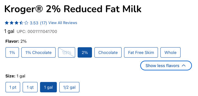
Unfortunately, the experience is not consistent, items still show up multiple times in the search results, and some items are still configured as a different item
And then you have items that absolutely should be grouped that aren’t:
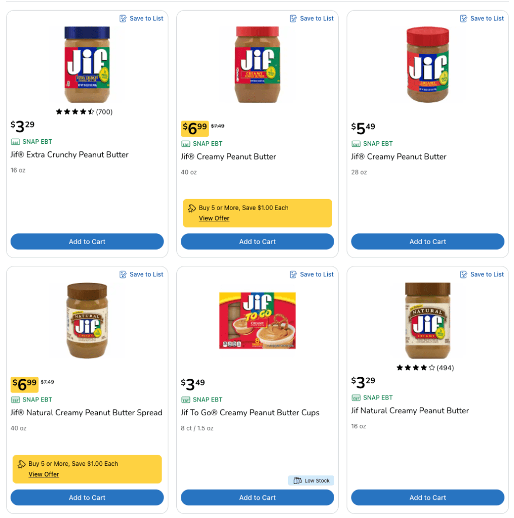
Suggestion
Continue the work you started and get all items of the same type/brand grouped to make it easier to find what you are looking for, in the size/flavor you want.
In-Store Only
If you have used the Kroger app then I’m sure you’ve been infuriated by this:
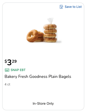
“But Josh!”, I hear you say, “Some items they might want to force you to come into the store for, or maybe their bagel selection/availability varies too much!”. Well, your first point is just silly, the shopper (Instacart or Kroger employee) is in the freaking store, but your second point is valid. Or rather it would be except they offer other bagels, from the bakery, for delivery:

There is simply no rhyme or reason as to what is or is not available for pickup/delivery vs in-store.
Suggestion
Make it make sense Kroger. I assume this is a data entry issue though I have observed it happening at Kroger stores that are hundreds of miles apart (specifically the bagel issue) but maybe it’s some flag set on plain bagels everywhere. It’s not just a bagel issue, I randomly see it on other items for which it makes no sense, like shelf-stable items that I can only get by going into the store.
Item Not Included
This goes hand in hand with the section above. For some reason when I go to checkout, it will tell me that some number of the items I have in my cart are not available.

What’s even more confusing is sometimes the “x item not included” message only shows up for certain time ranges. It’s completely random. It has nothing to do with things like when the deli or meat counter is open, it will sometimes just be the first time slot, it will sometimes be a random time slot in the middle of the list of options, there is no consistency at all.
Then, once you’ve removed the item (let’s assume it wasn’t available at any of the time slots), and you click “Continue” you are sometimes greeted with this screen/message:

It’s bad enough they can’t tell you while the item is still in your cart but having 2 places where they tell you something isn’t available just makes no sense and is frustrating.
Also, look at those corners, we’ve got 2 border radiuses/corners. I assume it’s because they need to be able to put that “not available” message above the item sometimes but please line up the border radius of these 2 divs.

Suggestion
Ideally, tell me it’s not available in my cart and/or when I try to add an item. Also, explain why it’s not available. From everything I can see there is no reason, I don’t know if this is a bug or what’s going on. At a minimum tell me all at once if things aren’t available.
Substitutions
Speaking of things not being available, let’s talk about how Kroger handles substitutions. A text field. A text field with only enough room for an OG tweet. A text field that only accepts a subset of characters. I hope you don’t do not use contractions to save some of your precious space:
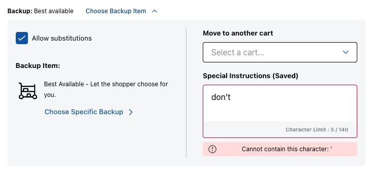
The best part? Yeah, anything you put in there isn’t saved for your next order. You have to type it in manually, every, single, time. This is one place where Instacart/Shipt blow Kroger out of the water. They let you pick a specific item as a replacement. However, I wouldn’t waste your time with this field, at least if your order is being fulfilled by Instacart, because the shoppers don’t read it. I can’t remember if the pickup (which is handled by Kroger) pickers respected that field or not but I often forgot to fill it out because it’s not prominent and since it doesn’t save what you put in, it feels like a waste.

I assume Kroger employees are better at this since I’ve had better luck with Kroger Pickup vs Kroger Delivery (fulfilled by Instacart) but Instacart shoppers don’t seem to be able to do basic substitutions. I’ve had 16 ounces of something substituted for the 32 ounces I asked for. You’re telling me they had no 32oz items and only one 16oz item? But I digress, I fully expect that when Kroger Blue Van delivery comes to my area this will improve.
Suggestion
Let me pick a specific item, let me pick multiple fallback items, and save my selections/text. This is a gold mine of data that Kroger is leaving on the table. Once you save this you can start using it to suggest substitutions to other users. Instacart pushes you hard to pre-select substitutions, it saves everyone time and means I don’t have to be “on call” while my shopper is shopping.
Low Image Resolution
While gathering data for this section I found something that really annoys me. It’s not, always, that the images are low resolution but rather on mobile they don’t provide images at the full resolution. Here is the same item zoomed in on mobile (pinch/zoom) and on the web (hover to zoom):
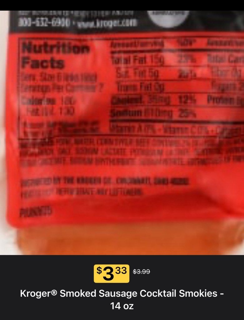
I can read the serving size and servings per container on the web but it’s incredibly hard to read on mobile. What about the nutritional facts? Don’t they have a section for this? Yes they do, this was a great addition whenever they added it, it wasn’t always there. Let’s take a look at the nutritional facts:

They do show servings per container for some items but some are just blank leaving you at the mercy of the 1-2 low-quality pictures they bothered uploading.
This is where I start to pull my hair out. Kroger, you have full access to the items you are selling. You could take high-quality pictures of the items and you could make it easy to see how big something is. Maybe I’m dumb but on more than one occasion I’ve over or under-bought what I wanted because the picture looked bigger/smaller. Yes, yes, they often list the weight/fluid ounces but that means next to nothing to me. I regularly have to look at all the sizes available (which are often not grouped nicely) and then translate to what I probably want. “I want the biggest one”, “I want the medium one”, etc. I often depend on things like “2 cups” on the package for something like shredded cheese to know how much I need but sometimes that’s too blurry to read in the image.
Suggestion
Take better pictures, take more pictures, and expose the full-resolution images in the mobile app. You could not do worse than what you have now. Set up a white sheet, have one of the 15-16-year-olds you employ use their iPhone to take 4 pictures of each item, and use those. It would be a massive step up from what you have right now.
Similar Items
It seems that Kroger has removed this widget that used to show on the item detail page in the mobile app. It still shows up on the web sometimes but it’s hit or miss. Sometimes they show related/similar items, sometimes they show “healthier options”, and most of the time they show nothing. To be honest, when these did show up on mobile the suggestions were horrible. It wasn’t personalized, it would show items that were only barely similar, and suffered from the lack of groups for size/flavor. It doesn’t help to show me something I do want if I have to go searching to find the right size.
I just don’t understand why Kroger is so bad at this. The only usable tools in the Kroger app are search, savings, and the weekly ad (more on that later). The “Shop” tab that shows you a list of departments will dash your hopes immediately. There appears to be no ordering or reasoning to the list of items it presents. It could have subsections under “Meat & Seafood” like “Beef”, “Chicken”, etc but instead you just get a list of items in a random order. It’s completely useless, you are always better off searching.
While searching is the best way to interact, it still sucks. You are forced to try to come up with a search term that will catch all the results you want but that means you need to be incredibly vague which results in getting tons of semi-related items. Even something more specific like “Sausage roll” returns hamburger buns and frozen omelets (that don’t have sausage in them). You have to constantly wonder if you are missing items and/or you have to slog through horrible search results.
Kroger, you have already come up with a solution to this. It’s called aisles/shelves. You already know (or you better know) where items are in your stores. Why can’t I see “Items around this item” physically in the store? Why can’t I go to the “Mexican” section, why can I go to the “Italian” section, why am I forced to deal with your god-awful search?
Here’s the thing, this failure on Kroger’s part is almost certainly leaving a ton of money on the table. If you come into the store they can advertise to you via end caps, signs, and by pairing related items next to each other. If you go to where the pizza crusts are in the store you will find pizza sauce and pepperonis right next to it. It wouldn’t be practical to put cheese near it in a physical store but you absolutely can do that in a digital store. Make 1 button I can click to get pizza crust, pizza sauce, cheese, and pepperonis. Have little (+) buttons for other toppings (tomatoes, peppers, olives, etc). Make it easy to buy everything you need for a meal.
Suggestion
Let me look at aisles, let me look at a list of items next to this item in the physical store, let me price compare by size within a product type, let me see all the flavors, and make it easy to buy items that are connected/related.
Change Cart Type
I don’t think I’ve ever run afoul of this on mobile but on the web when I want to see what’s in my cart I click the cart icon in the top right, then I have to click again to see the list of items. Kroger will show you a few images of what’s in your cart but you can’t click on them, you need to click on “Show All Items”. The problem is the “Change to Pickup” button is just as prominent and my cursor is drawn to that button like moths to a flame. I don’t know why, again I could just be dumb, but I’ve clicked that button more times than I can count.

There is no confirmation, there is no undo, and then sometimes you get notices that some things aren’t available for pickup (which also makes no sense to me), and then you have to convert your cart back and hope nothing was lost in the process.
Suggestion
That button does not need to be that big/obvious and it should have a confirmation step. Furthermore, I only have 1 cart I’m adding items to at a time and it’s always a delivery cart, why can’t you just take me to the “Show All Items” screen by default when I click on the cart with some UI at the top to see my other carts (if I have any).
You can still add items to your order
Kroger seems to have changed this in the last few weeks, maybe longer, I had no idea it had changed until I randomly tried it again. After you place an order for delivery or pickup you get a text like this:
“Your Kroger Delivery by Instacart is confirmed. And remember, you can still add items to your order.”
Up until recently, that was not true unless you had placed an order for over a day in the future. It didn’t matter that your order might still be hours out and the Instacart shopper hadn’t even been chosen, let alone started shopping, your order was locked and you were out of luck if you wanted to make changes. Just last week I forgot something and saw the “Edit order” button in the UI wasn’t greyed out like normal and got very excited. “Finally!” I said, I added the extra item, saved my order, and moved on. What I didn’t realize (and if there was UI for this it wasn’t clear) is that this caused my order to get moved out by about 2 hours. I made the edit minutes after initially placing the order. It was far from the end of the world but could have ruined plans if I wasn’t going to be home or needed the items to make something for an event later that night.
Suggestion
Let people edit their orders until shopping starts, or at least until a shopper has been picked. For pickup orders don’t cut off edits at midnight, cut it off once someone starts to pick the order. And if you are going to shift the delivery time make sure that’s in big bold letters.
Weekly Ads
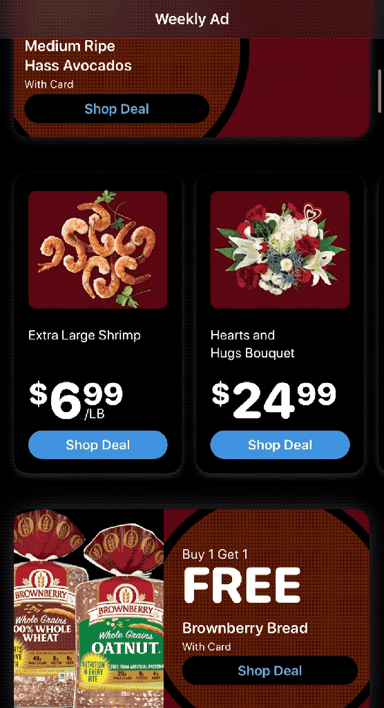
Here is a place I want to praise Kroger… well I also have a complaint but I do want to applaud them for improving this. It used to be essentially a scan of the mailer they sent out where you could click on items (think image map). It wasn’t great, it was hard to read on mobile, and originally it only let you “add to your list” which is a separate concept, it’s just a shopping list, not related to delivery/pickup. Somewhat recently they converted that to a list of items in the app you can scroll through. Perfect right? Right?
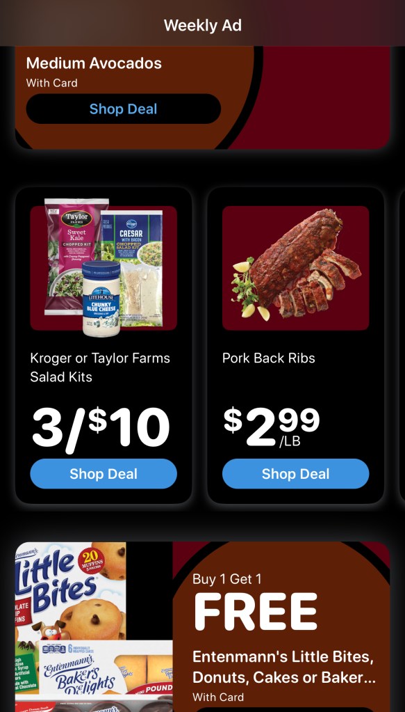
Well, when I scrolled through I thought “Huh, seems like a lot fewer things on verses the old image style weekly ad”. Then, by accident, I learned there were more than just 2 items in each “section”:
Suggestion
Make the tiles smaller or larger so that 1 tile is slightly off-screen so it’s clear there are more items if you scroll horizontally.
What’s Kroger doing right?
I’ve spent this whole post beating up on their app and website so why don’t I go use Instacart or Shipt instead? It’s simple: cost. These 3rd party delivery services add a significant upcharge (25-30%+) and you can’t use coupons. Go create the a cart on Kroger and then add the same items on a 3rd party delivery service, I think you’ll be shocked at how much you are overpaying.
Coupons are the one part of the Kroger app that is almost perfect. The filtering is pretty decent, and necessary unless you want to scroll through pages of alcohol and other things you don’t care about. The ability to clip coupons and find eligible items is almost perfect. Sometimes the list of eligible items is very long and in almost random order. You don’t know if the flavor/etc you want is further down the list or not eligible. On the checkout screen, the app will warn you if you haven’t clipped all the applicable coupons for items in your cart. Major props to Kroger on this.
Kroger Pickup is the other bright spot which makes me optimistic for Kroger Blue Van delivery. I know that outsourcing delivery to Instacart is just a stepping stone, a necessary evil, while Kroger rolls out its alternative but I cannot wait for actual Kroger employees to pick my order. My pickup orders have almost always left me delighted with their substitutions and their policy of always giving you the lower price even if the substitution is more expensive is nothing short of amazing, which maybe says more about what I’m conditioned to expect from massive companies.
I often wonder if Kroger could find a nice middle-ground while they roll out the Blue Van delivery. If they could have their Kroger Pickup employees pick all the delivery orders and then just pay an Uber-like service to do the delivery aspect. I’m sure it’s not worth it for them now as they race towards replacing Instacart but surely it would have been better for them as a brand and saved them money.
Conclusion
I want Kroger to improve, I want them to succeed, and I want to not go crazy when shopping for groceries. Kroger has all this data at their fingertips, in most cases, they already have what they need and in the other cases they could get what they need easily. Instacart and Shipt came in and showed you how to do it, shameless copy them, they can never beat you at this game, they don’t have the products, they are an over-the-top service that is dependent on you. You can undercut them with ease (both in price and data) and you should.
